How to be a good writer: Write with respect.
Respect for the craft. And respect for the reader. It’s obvious. But it’s also hard to do — and increasingly rare.
Lots of companies and digital products don’t respect their audience. They load their interfaces with uninspired headlines, clunky navigation labels, and an inconsistent brand voice. Worse is the new language of “growth hacking.” Deceptive, annoying, occasionally illegal phrasing that’s designed to confuse or mislead.
Writing with respect is more than the usual digital tropes about “being friendly” or “sounding human.” It’s about recognizing the power of words to influence the way people feel.
Write with respect.
There are lots of things you can start focusing on right away. Here’s eight.
Write for people as smart as you.
Not just smart. As smart as you. Respectful writing should recognize users’ intelligence. Yes, a user may be new to your product or less informed about a specific subject. But that user is still smart. So ditch any language that makes unkind assumptions. Be thoughtful about the words you use and the way they might make a person feel.
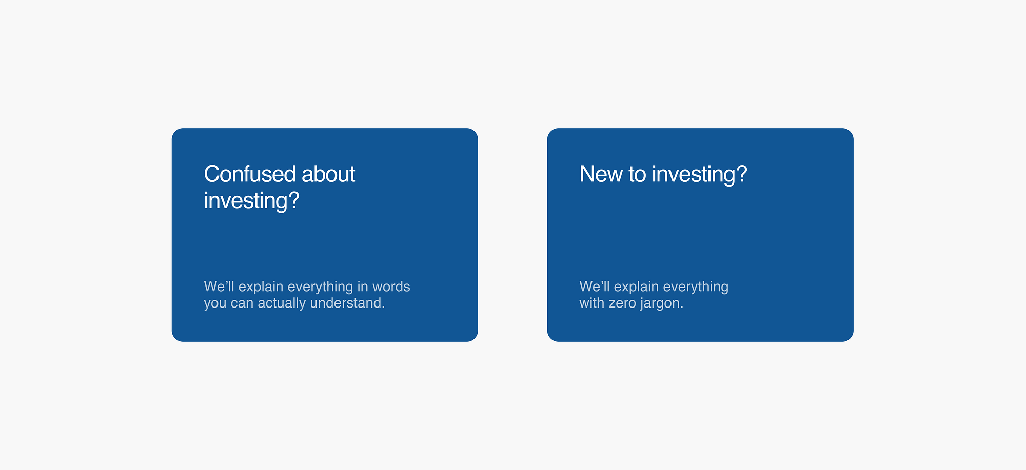
Explain why.
Need to ask a personal question? Or get some sensitive information? Respect your users by adding context. Maybe you’re legally required to get a home address for tax purposes. Or you need an email address to save their progress. Whatever the reason, tell the truth. And if you don’t need to ask at all, think about removing the question altogether.

Make everything easy to fix.
A perfectly designed product will still have issues. The WiFi can go down in the middle of an upload. A package might get delivered to the wrong address. When these kinds of mix-ups happen, acknowledge them. Then quickly give a solution or next step. Respect means fixing things fast. A user shouldn’t need to navigate to a Settings section or hunt around for customer support.
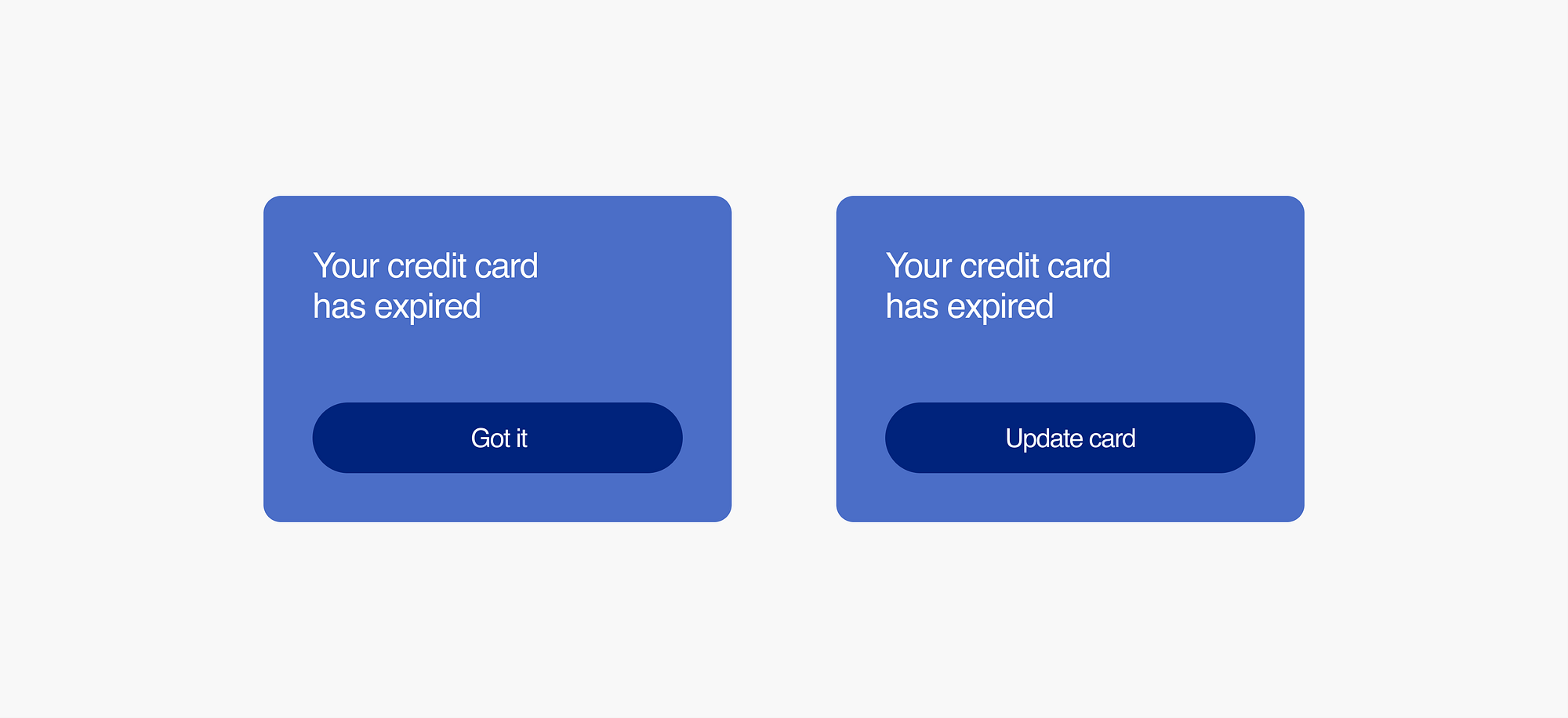
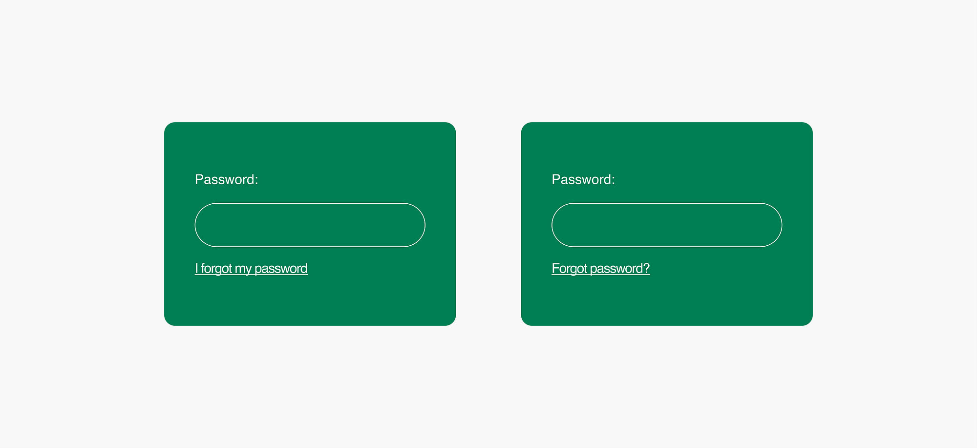
Don’t blame the user.
One simple way to do this: write without a first-person tense. More specifically, try dropping the word “I” and write a simple sentence fragment. The small, subtle shift shown below can completely change the way a user feels. Sure, the user was the one who forgot the password. But there’s no need to rub it in.
Let people skip forward.
In-depth onboardings can be helpful. And personalized experiences are great. But some people like to dive right in and start using your product. So make things optional and respect their time. Let people check out as guest. Maybe even get rid of required logins or email capture. If people want to sign up, they will.

Slow down big decisions.
Speed is usually good. But sometimes UX writing should slow things down and add friction to an experience. Think: permanently deleting an account. Or sharing private information like a Social Security Number. These moments often need more context and explanation. Not everything needs to be so simple or fast.
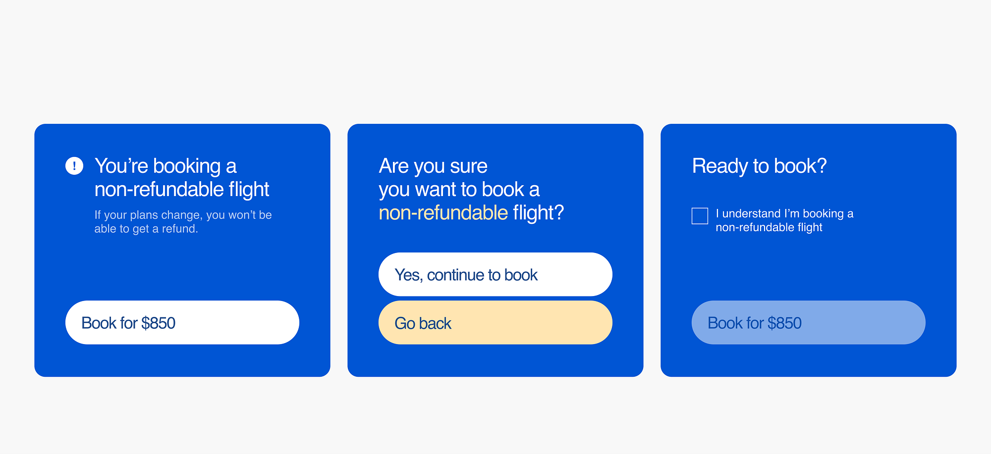
Say what things cost.
Prices matter. Be up front and include them. Respect your users by giving them the info they need . Be equally clear about anything else that might cost money down the line, like cancellation fees & auto-renewals. Nobody should ever be tricked into paying for something.

Write with clarity, not snark.
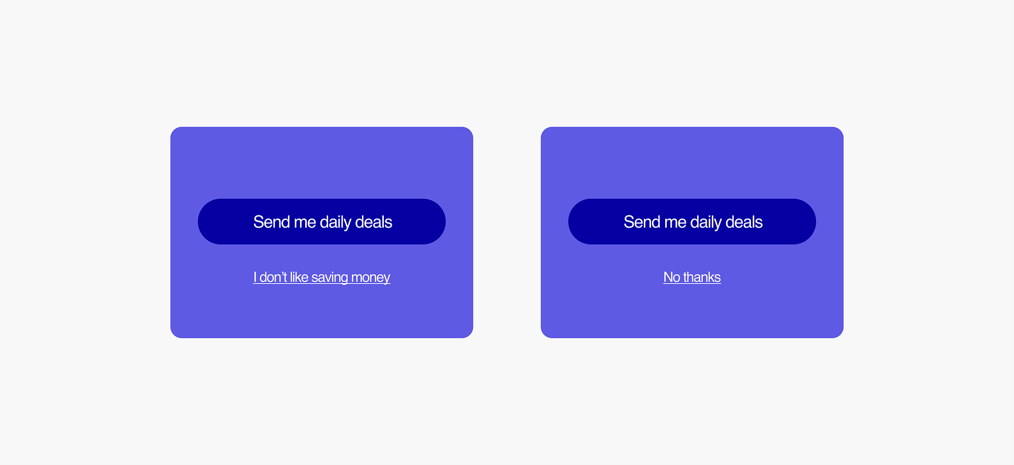
Be careful with humor and personality. User decisions should never feel like snide judgements. When in doubt, remove any extra “attitude” or backhanded cleverness. Keeping interactions neutral will also make them clearer.
Written by Nick DiLallo
Published in UX Collective

·


